
Wayfair - Custom Furniture Buying
Platform: Mobile web and desktop
My role: UX research, design
Objective: Create a way for users to quickly and easily build custom furniture on Wayfair.com without the luxury of an in-person shopping experience.
Result: 12% lift in conversion for all included products.
Research
I looked into twelve direct and indirect e-commerce competitors to examine how they were handling the visualization and creation of custom products. I found that they were handling this in one of two ways:
-
Adding rows of swatches underneath color and fabric options.
While this works for one additional option, such as leg color, it could prove to provide a substantial amount of scrolling if there are more than 3 visual options with 10+ colorways.
-
Bringing customers into a separate experience.
To avoid confusion and really drive home the custom experience, the other half of competitors researched have a separate landing page with a large interactive image for substantial customization.
A quick breakdown of features offered by each competitor:

As I began wireframing different solutions, it also became apparent that we needed to look to the future and consider how this new UI could serve products outside of the custom upholstery program.
What makes a product "custom"? Having more than one visual option? More than three non-visual options? A combination of the two? This became an ongoing conversation between myself, product management, and category management - those in charge of defining our product catalog and working with suppliers to provide the best selection possible for our users:

Wireframes
Early wireframes attempted to recreate what I had seen in most of my competitive research -- product options surfaced on PDP, without bringing users into a separate, multi-step experience. However, none of these competitors were offering the ambitious scope of options that we planned to roll out, and it quickly became apparent that I would need to create a new interface to support our level of offerings.
The wireframes below show two early proposals for displaying customization options on desktop. Clearly this would not translate well to mobile!


After several iterations and rounds of feedback between my product managers and creative team, I landed on the final wireframes seen below.
The design incorporates a right-side drawer and expanded image modal that layer over the PDP, allowing the user to quickly and easily customize a product while feeling like they haven't left the product page. Meanwhile, data optimized pre-selected options cater to users who want to check out quickly without diving into a multi-step experience.
 |  |  |  |  |  |
|---|---|---|---|---|---|
 |  |  |
Wireframe Annotations - Desktop
1. “Customize and Buy” CTA
As on mobile, the “Add to Cart” CTA is replaced with a “Customize and Buy” button that prompts the subsequent customization drawer and expanded dynamic image.
2. Customization Experience
The drawer on the right is 414ppx, an expansion in size from the 392px related items drawer. The image dynamically fills the remaining desktop space.
As on mobile, tapping “Back” will return the user to PDP.
“Add to Cart” appears at the bottom of the menu of options.
The price and shipping info at the bottom of the menu dynamically update asuser makes changes to pre-selected categories.
Option Detail Screens
Tapping “Back” at any time will return the user to the Custom Options screen.
"Add to Cart" is replaced with “Save and Continue.” This will advance the user to the next option in the list of options from the Custom Options menu screen.
All options are pre-selected to category management-mandated defaults.
 |  |  |  |  |  |
|---|---|---|---|---|---|
 |  |  |  |  |  |
 |  |
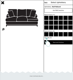
Wireframe Annotations - Mobile
1. “Customize and Buy” CTA
This CTA replaces ATC and opens the customization modal experience.
2. “Custom Options” Modal
Tapping “Back” will return the user to PDP.
“Add to Cart” appears at the bottom of the menu of options.
The price and shipping info at the bottom of the menu dynamically updates as the user makes changes to pre-selected categories.
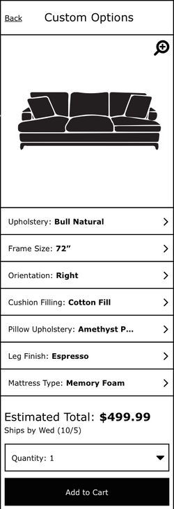
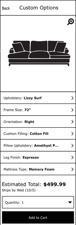
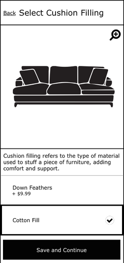
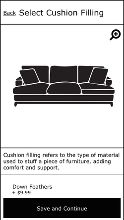
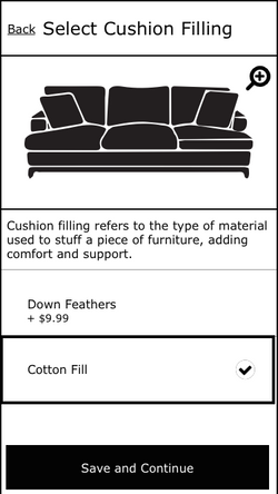
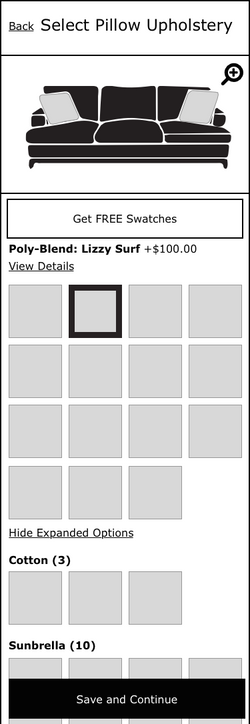
3. Option Detail Screens
Tapping “Back” at any time will return the user to the Custom Options screen.
ATC is replaced with “Save and Continue.” This CTA is sticky. This will advance the user to the next option in the list of options from the Custom Options menu screen.
All options are pre-selected to category-mandated defaults.
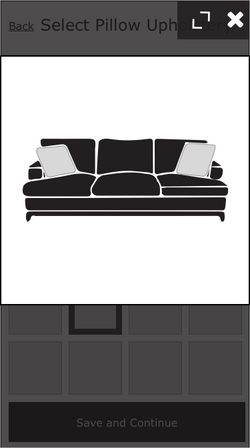
4. Silo Images
The size of the product will remain the same from PDP, with the white space cropped in order to maximize real estate on mobile. User taps image to zoom.
UI Mocks + Testing
In-person user testing was completed in Q2 of 2017, with some design and copy tweaks in order to clarify some of the functionality. In addition, we completed a day of rapid-prototyping style testing, which allowed us to make quick iterations throughout the day as we had nine customers walk through the experience.
Once this product was live, we began developing more ways for users to interact with the 3D modeling technology-- viewing it in their spaces, seeing the products at multiple angles, and using models to determine scale in rooms with other furniture.
The experience is now live on sofa SKUs. Try it out here!
https://www.wayfair.com/furniture/pdp/sarah-sleeper-sofa-cstm2244.html?piid=22241244%2C22215972
